
Overview
- Project Title
-
Shhlist | Make a wishh. A mobile app that reinvents our gifting experience in today's complex and volatile world.
- Project type
-
UX/UI practice project
- Project timeframe
-
April - June 2021
- My roles/tasks
-
Management (idea, concept, project planning, reviews) | UX analysis (feature planning, user flows) | Design and UI design (branding, design system, UI mobile app) | Wireframes and partial prototyping (for key flows and interactions) | Case study
- Tools
-
Figma | Miro
- Project summary
-
The idea of a wishlist app originally came to fruition during my time at the Ironhack bootcamp in 2018. Being part of a two-person team for our second project, we solely focused on the frontend coding part of the equation. Recently I decided to tackle the topic again - this time from the UX/UI perspective. I went back to square one, just kept the original idea. Based on actual research, I completely reworked the concept. This foundation allowed me to successfully dive deeper into the field of UI design and user experience. The end product is a mobile app mockup, based on a solid concept. Selected actions/features have been visualized as prototype.
- Challenge
-
Specific user problem
Gifts are an impactful mean to maintain relationships and overall a common practice in our society. Good gifts require time, effort and creativity or even profound knowledge of the receiver. The chore to find a present is tempting to be shelved for later. Short term, rushed decisions might entail an uninspired gift, which causes disappointment and frustration. Supposedly a nice gesture, it rather fails to serve its purpose and can be counterproductive.
-
User needs
An app that takes away the cognitive load during the gift finding process all the while ensuring a result that will exceed expecations. It should transform the whole gifting process from a burden into something light and fun which helps the user making a positive impact on their relationships.
-
Pain points
_Build up a solid user base
_Strategic and focused marketing to reach also those using competitor products
_Research shows that apps get deleted quickly after last use → user engagement needs to be kept high by frequent success experiences
_Dependency on user and their network (contacts) relevant to proper feature functionality → incentivize user to share data
_Difficulty of well-balanced, non-intrusive, relevant communication with users to keep them engaged
-
Technical constraints
_App with a wide variety of features can get data-heavy
_Features (e.g. price alert) require efficient web scraping, good analysis of databases and well-guided task automation (AI)
_The app concept is based on a networking idea. The user's network is crucial basis for the app's functionality -
Business requirements
_Proper launch
_Reach and incentivize potential users to download app
_Convince users to keep and use app
_Incentivize users to share data and generate more users (share contacts, invite friends)
_USP to differentiate from competitors
Research
MY MOTIVATION
Ideation
What might seem a trivial thing, should not be underestimated. The act of gift giving is actually an essential part of the glue that holds people together. It would not do justice to diminish gifting as a superficial or even superfluous act.
On the contrary, a well picked gift stands for the attitude of the giver towards the receiver. It’s not the material value but rather the quality of the gesture, which has the potential to leave a significant impact on relationships - be it in a good or a bad way.
“Gift exchanges can reveal how people think about others, what they value and enjoy, and how they build and maintain relationships.”
The psychology of gift-giving and receiving. ScienceDaily, 22 Dec 2014. 1
DO WE NEED ANOTHER APP?
The challenge
Remember the last time you needed to get a present for someone? If you know a person really well, you are all set for finding a good gift with ease. But what about those people one doesn’t know all that well? For some of us, a situation like this might bring the sweat to their brow.
This leads us to the first hurdle. The world around us is changing faster than ever before. Daily obligations paired with the ceaseless urgency of keeping track of everything, often result in a constant lack of time. Outstanding and unique gifts with this “personal” touch require time and effort though. Or at least some deeper knowledge about the receiver. In those cases, where I’m not as close to the recipient, the gift quest can be a tricky challenge.
“Five studies show that gift recipients are more appreciative of gifts they explicitly request than those they do not.”
Francesca Gino, Harvard University/ Francis J. Flynn 2
This might compel one to opt for an uninspiring, yet “safe” gift. The intention behind: it’s at least a nice gesture. In the end this attitude might be ok but won’t truly score. Un ininspired, rather vanilla choice could easily be perceived as unconsiderate or even wasteful. Especially if the relationship between giver and giftee is of high relevance, one would prefer not to come off as unconsiderate.
While a lot of responsibilities simply have to be taken over immediately, the occasion of the gift often lies in the future. That’s how choosing a gift is the kind of task set up for procrastination. As long as it’s not that urgent, the delay to a ‘later’ point of time might seem acceptable. Approaching the deadline, one would finally end up with lackluster choices or rushed decisions.
If I don’t want to be unconsiderate or disappointing - why not simply ask? Here’s the dilemma.
Explicitly asking the giftee for wishes as well as proactively sharing your own can come across awkward. Not for everyone, but a lot of people might see this straightforward approach as an unsensitive option.
It also deprives both giver and receiver of the emotional potential an unexpected gift can unfold. A surprise that hits the mark is quite powerful. It stands for how much the giver cares and knows about the receiver.

Imagine you could hit the mark with a surprise | Photo by Jacqueline Munguia on Unsplash
RELEVANCE OF GIFTING DURING PANDEMIC
Risen emotional needs
During the years 2020 and 21, a phenomenon emerged. Long, recurrent periods of lockdowns and strict measures of social distancing created a widespread feeling of isolation. People began to crave more emotional proximity — and needed to create new ways of bridging the gaps, caused by physical distancing measures.
Gift giving is important because it strengthens interpersonal relationships. Gifts have always been a sign of love and appreciation, but during the pandemic they sort of became a compensation for missing physical closeness.
A personal, meaningful gift sent to family or a friend can be a creative way to bridge the distance on an emotional level.
The brass colored hoop
Quick Facts
Data on gifting
“Global searches for ‘online gift’ increased by 80% in 2020 compared to 2019.”
Maria Helena Marinho, think with google 3
“In fact, research shows that people are more appreciative of gifts they ask for than ones they don’t.”
Elizabeth Dunn, Psychology Professor at the University of British Columbia 4
“A number of people told us they were overcompensating to make up for […] lost experiences.”
Maria Helena Marinho, think with google 3

Photo by Harry Cunningham on Unsplash
WHAT’S ALREADY ON THE MARKET
The Competition
There’s no shortage of gift or wishlist apps on the market.
Close analysis of competitor products though revealed major gaps when it comes to features that I would have expected for such an application.
One of those missing functionalities was money pooling. I analysed 12 different gifting apps and not one of them included this feature. There are definitely several apps covering money pooling, but none of them integrated into a gift planning app.
Another feature I couldn’t find in any of the apps examined, was a proper feature for monitoring price development for a favored article within a certain timeframe. Apps with this functionality do exist, however, not in combination with gift planning.
Besides I expected to see more gifting apps covering offline functionality, which I truly consider a crucial feature. Just one single app of the analyzed ones provided it.
Ideas don't wait for wifi connection | Photo by Maarten van den Heuvel on Unsplash
Being offline or having a flaky data connection should not be an obstacle for usage of the app. The timing for having ideas cannot be planned by the user. Providing a reliable option to capture ideas at any given time will tremendously upgrade the user experience.
COVERING THE NICHE
The objective
My goal was to enable the user to get gifting organized in a kind of ‘one-stop-shop’. With an app where inspiration, networking, communication, planning, money pooling and gift purchasing coexisted.
HOW MANY APPS IS THE USER WILLING TO OPEN TO SOLVE ONE TASK?
There would be absolutely no need to switch between apps or channels, to leave no risk to overlook any step in the gifting process.
RISK CONSCIOUSNESS
The Venture
Building a brand new app, one starts from scratch. With no existing userbase, it’s important to not only reach the right customer but also to timely convince them of the benefits. A study by Gartner revealed, “that the mobile apps’ commercial success for the year 2018 was 00.01 percent, which is just one successful app out of 10,000 apps”.
“Less than 0.01 percent of consumer mobile apps will be considered a financial success by their developers through 2018”.
Gartner, Inc., Press Releases, STAMFORD, Conn., January 13, 2014 5
Next to the initial market recognition, there’s yet another critical hurdle to be taken. Ross Benes, eMarketer Senior Analyst, Insider Intelligence, says it’s “pretty common for smartphone users to quickly discard apps”. Once downloaded, there’s in average just a very short timeframe to convince the user of this new app being pivotal to them.
“From January-July 2018, Adjust analyzed 8 billion app installs worldwide and found that on average, apps get deleted in 5.8 days after they’re last used.
Ross Benes, on Insider Intelligence Inc., Sep 13, 2018 6
Without user data (calendar, contacts) the social aspect of the app cannot fully come into play. Therefore, having a solid incentive for the user to share their data, especially contacts, in the very beginning is crucial.
Only if the app can unfold its full potential and USP right in the beginning (including social features), there’s a realistic chance to convince and bind the user.
Creative Process
Briefing
Based on my market research, I developed a detailed briefing as a foundation for my work. Instead of client meetings where I would present and discuss stages, I would use this as the guide to adjust my design choices and create the different iterations.
CUSTOMER JOURNEY MAPPING ON MIRO
Drafts & user flow

Drafting wireframes | Photo by Kelly Sikkema on Unsplash
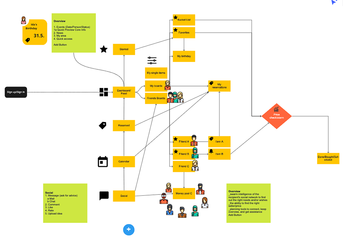
I started sketching out main features and a basic hierarchy by hand. I used miro to visualize a user flow, as the basis for future wireframes that I would create in figma.
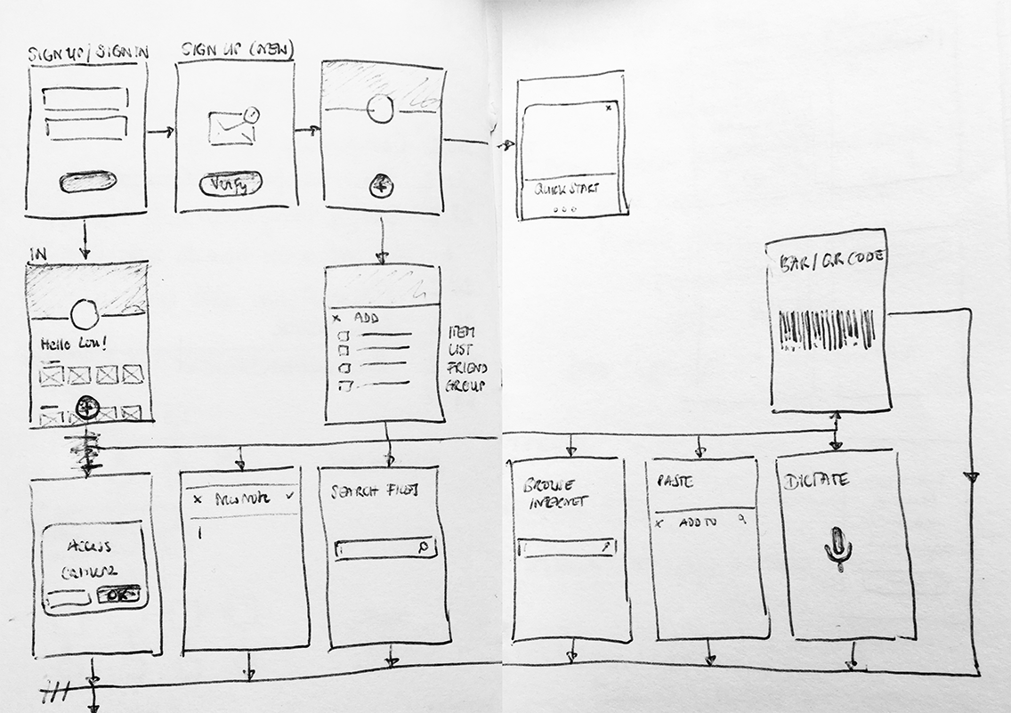
First ideas roughly sketched out by hand
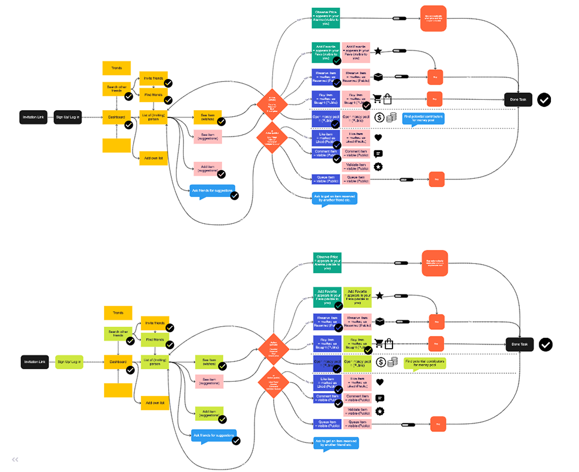
User flow built in miro
Creation of several user flows at different stages of the work
DESIGN THINKING
Iterations & Prototyping
Following the Design Thinking methodology, I created several iterations to approach my end result. If I were pitching this to the client, I would get their feedback and discuss further procedures.
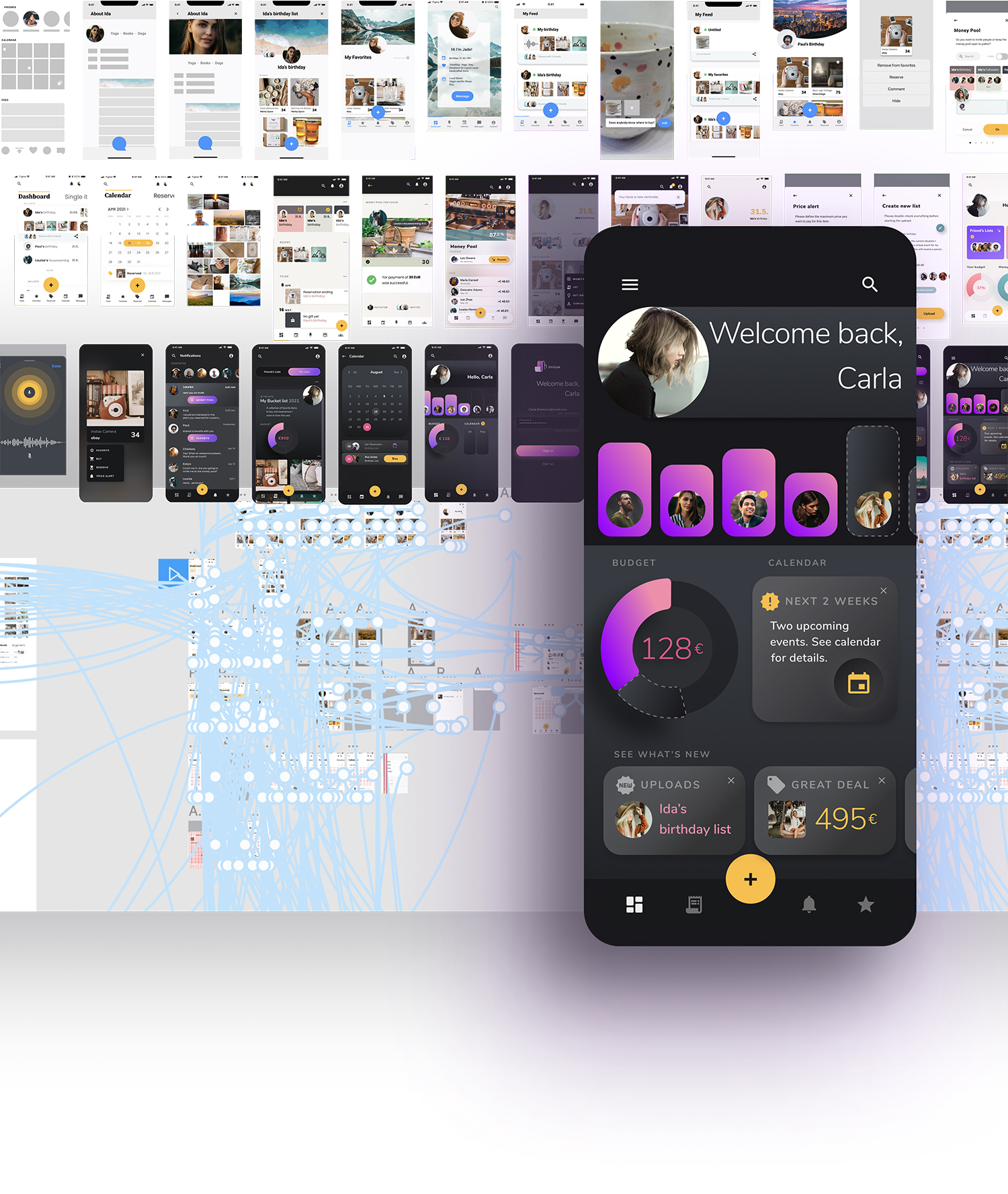
Iterations and Prototyping in Figma
In this mock environment the briefing was my red thread. Additionally to revisiting the brief, I continued to ask a small group of test users to evaluate the different stages.
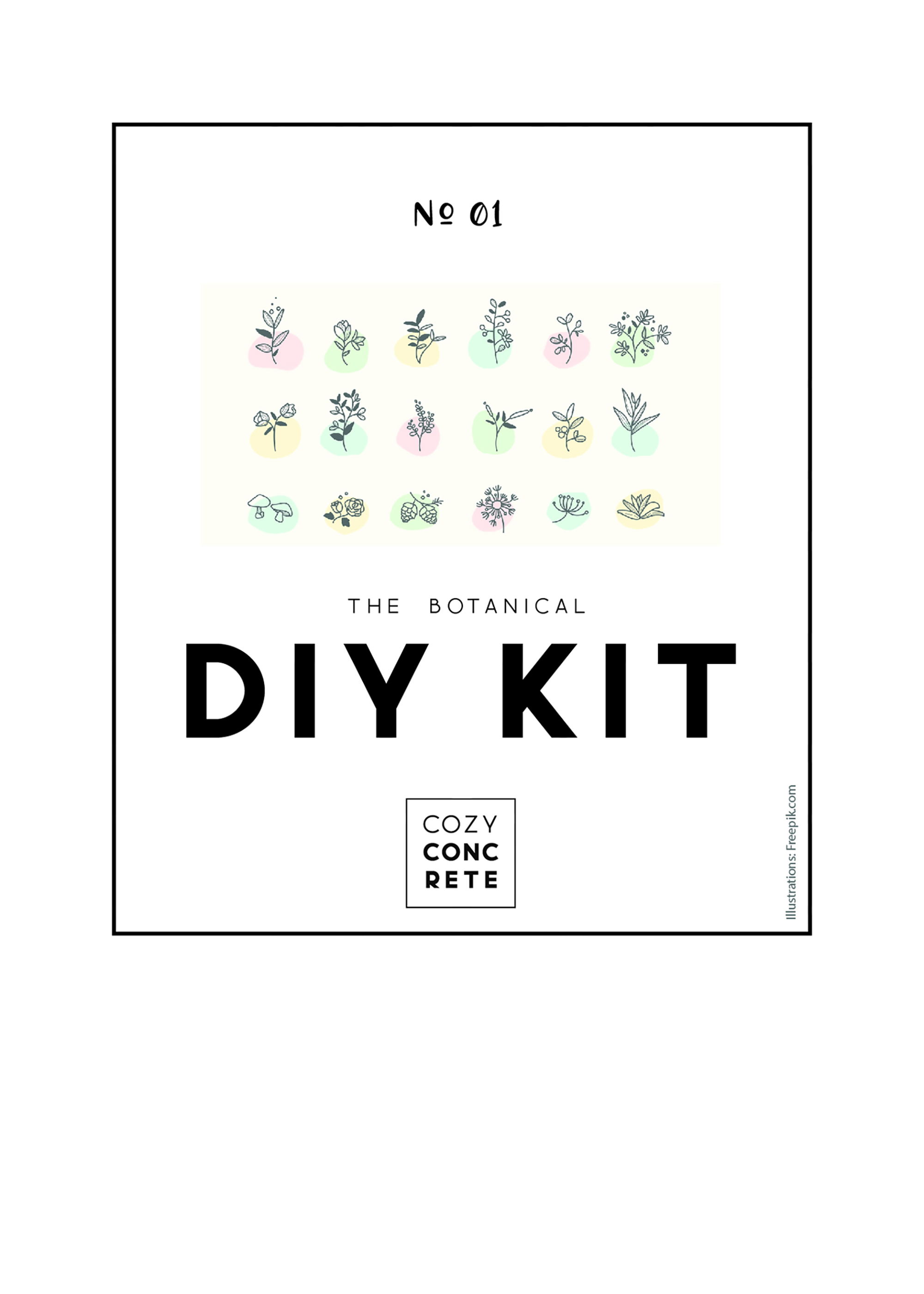
Corporate Design
As there is no existing brand behind this app, a basic brand design needed to be developed. I worked out a name, logo and design system for the app.
Name
The name sshlist is derived from the term “wishlist”. I joined it with the shushing sound: “shh“. The shushing is an integral part of the name. Enabling the user to find the perfect gift for a person, without waiving the surprise factor is one of the core features of my app concept. It may be considered the most fun and rewarding part of the gifting process - knowing you got the right gift for someone, who at the same time doesn’t expect it.
This suprise factor is being enabled by the swarm intelligence of the giftees social network, or in other words the friends invited to a specific list. They can collaborate to exchange gift ideas without letting the list owner know. It can be considered a win win (win) situation, as it’s not only exciting and fun for the gift giver, but also for the giftee, plus for the one who shared their idea with the group. No need for uninspired or predictable gifts anymore!
Due to the corresponding letters in “wish“ and “shh“, the resulting brand name can be considered a blend of both. By slightly shortening the term plus adding another letter, the name gets a nice little twist. It’s still recognizable and has the potential to create an aha moment.
The visual language
App logo
The logo picks up both root terms, the idea of the list and the shushing sound (shh). The two letters “s“ and “h“ are interpreted in a stylized way to visualize a list.
Logo variations
The suggestion of three-dimensional space underlines the idea of a long, curling paper list, which forms the letters “sh“. Here again I dropped one letter, the recurrent “h“, in favor of clear and concise visuals.
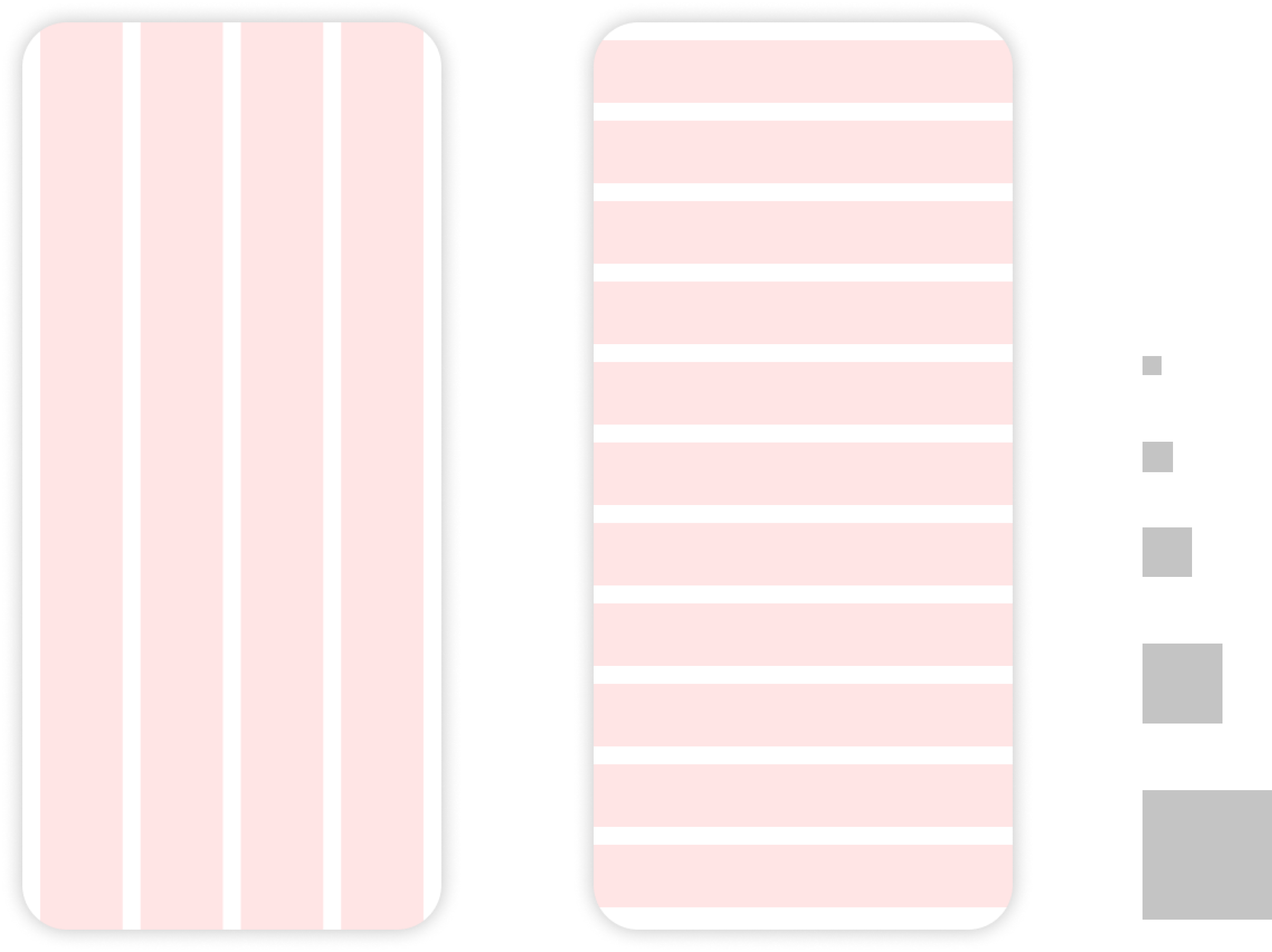
COLOR SCHEME
I developed the layout concept for a dark theme. According to material.io dark themes “help improve visual ergonomics by reducing eye strain, adjusting brightness to current lighting conditions, and facilitating screen use in dark environments – all while conserving battery power." In theory, this would be completed by a light theme, however I focus on just one in this case study.
"[Dark screens] help improve visual ergonomics by reducing eye strain, adjusting brightness to current lighting conditions, and facilitating screen use in dark environments.
material.io, Google 7
For the primary colors, I chose a warm yellow and secondary a vibrant violet. Their hues are complementary on the color wheel.
The color decision was mainly led by objectives like: legibility, color theory and creative inspiration. The vibrant violet was chosen for its vividness, luminosity and brightness on a dark background.
The palette is complemented with two rose/pink hues. One of them was applied to create a vibrant gradient with the violet.
To mitigate the straining effects of harsh black and white contrasts and for better legibility, I opted for an off-white and an anthrazite.
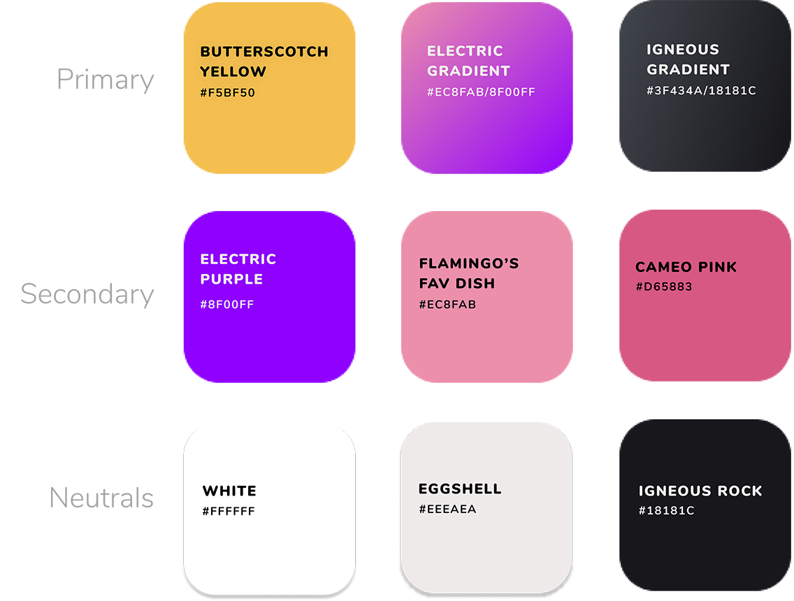
Color scheme
Typography
As for the font, I chose Nunito. It’s a Google font developed by Vernon Adams and was designed primarily as a display font. It is a nicely balanced Sans Serif. Its rounded character pairs well with the other rounded elements in the app, like buttons, tiles and other subtle details.

Nunito font by Vernon Adams
For sizes and ratios, I generally followed advice from font size guidelines. The ratio for increasing the letter size was developed based off of the golden section (rounded to 1.62). Not every incrementation follows this strictly, but most are based on it.
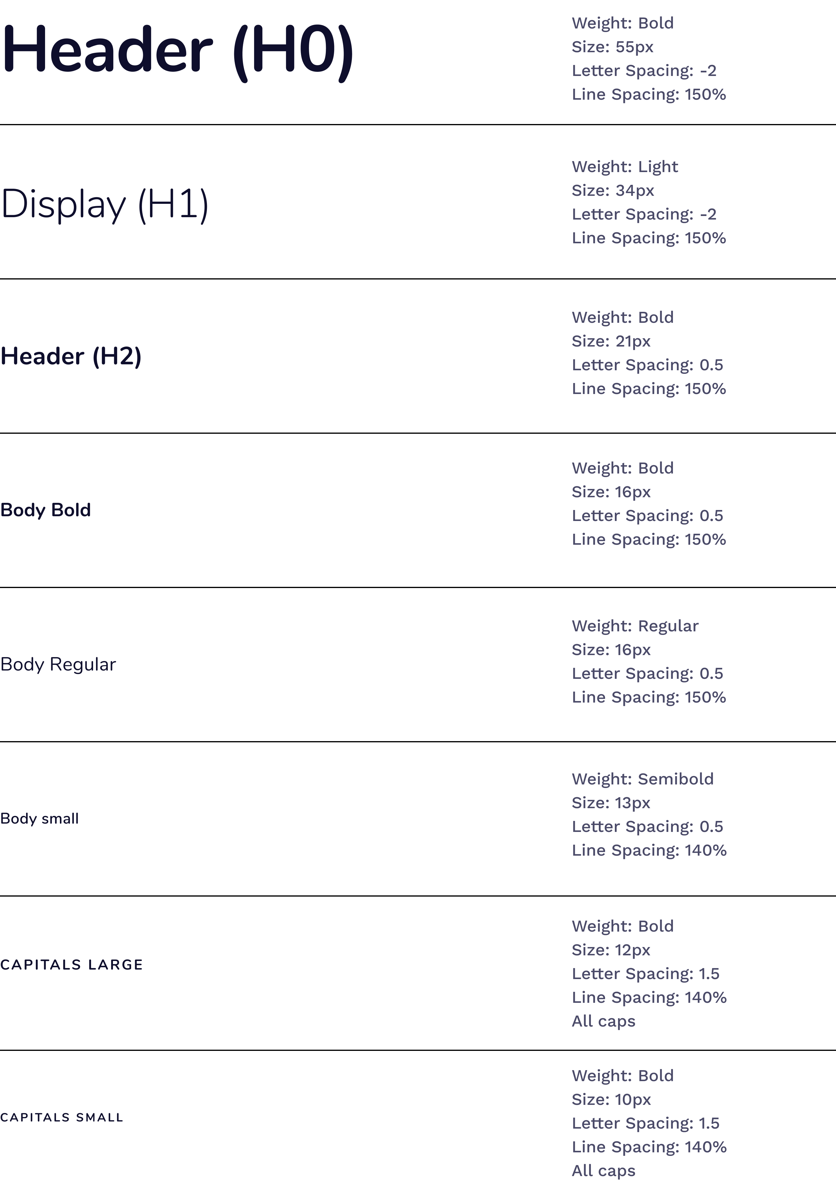
Type scale following golden section
Iconography
Most of the icons in the app have been taken from Google’s Material Icon selection. I wanted to be sure that the main icons would be well-known and I strived to apply them according to their original meaning. In some cases however, like in the section wishlists I use the icon originally called ‘receipt long’ by Google to depict a wishlist.
I decided to develop some additional icons, following the Material Icons' visual language, to round out the selection for my purpose.
Icons
Grid and spacing
The grid is divided in 4 vertical columns and 11 horizontal rows with an offset, margin and gutter each being 16px.
I created a spacer, incremented according to the golden section, the same ratio I applied for the type scale.
Grid and spacing
Accessibility
I followed Apple’s Human Interface Guidelines in terms and made sure to set the minimum tappable area for touch targets to of 44px. For primary buttons, I chose a bigger size of 56px. The smaller variant was necessary to be used on top of tiles, for example.

Touch target sizes
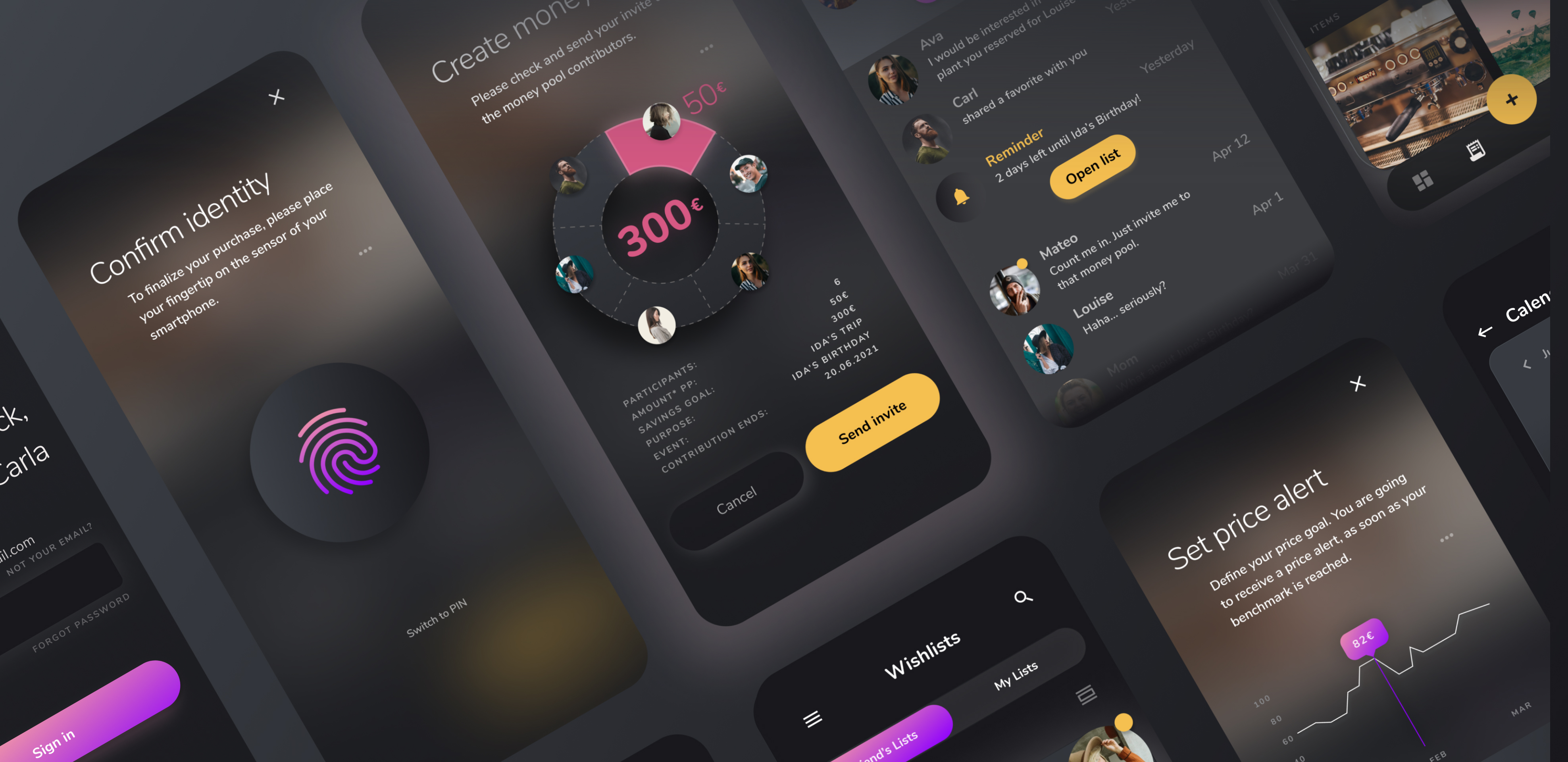
Prototype
Setting apart from competitors
Defining the core features
First and foremost was the idea of using the synergetic effects of the user’s social network. The money pooling function would only be a fraction of the networks' full potential.
Why not make use of the swarm intelligence of the giftees social network?
My idea was to make each user benefit from the networks' swarm intelligence in order to reach better overall gift results. Not taking advantage of this opportunity, I considered it to be a major waste of intelligent resources.

Use the network's swarm intelligence | Aaron Burden on Unsplash
After evaluating my research, and with focus on the gaps I discovered in competitor products, I defined the following core features. To ensure a unique selling point (USP), making the app clearly stand out against the competition and gain significance, these points needed to be coverered:
- Use of synergetic effects for gift search
- Money pooling
- Price alerts
- Offline functionality
Discover the pleasure of giving gifts
Shhlist features
With regard to the social aspect, the app covers all areas and stages of communication around shared wishes, uploaded ideas, reserved or picked items and money pooling.
Shared and private state
Confidentiality
The user can create wishlists for others - and for themselves. All wishlists can be accessed by the user via the second icon in the bottom navigation bar. This section is split to clearly differentiate between lists the user owns and friends’ lists they are invited to.
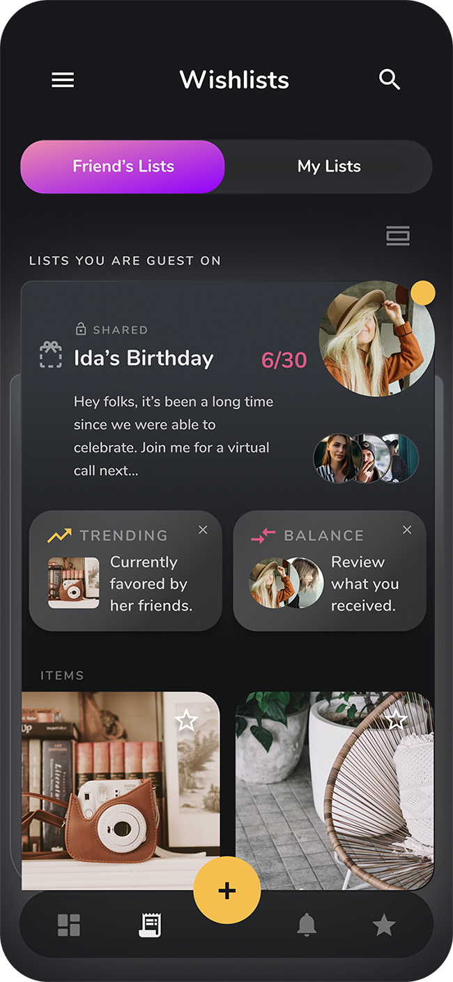
Wishlists contain your saved items, like e.g. wishes or ideas.
The user defines whether a list is private or shared. As long as a list is marked as private, no other user other than the owner themselves has access to any data on the list.
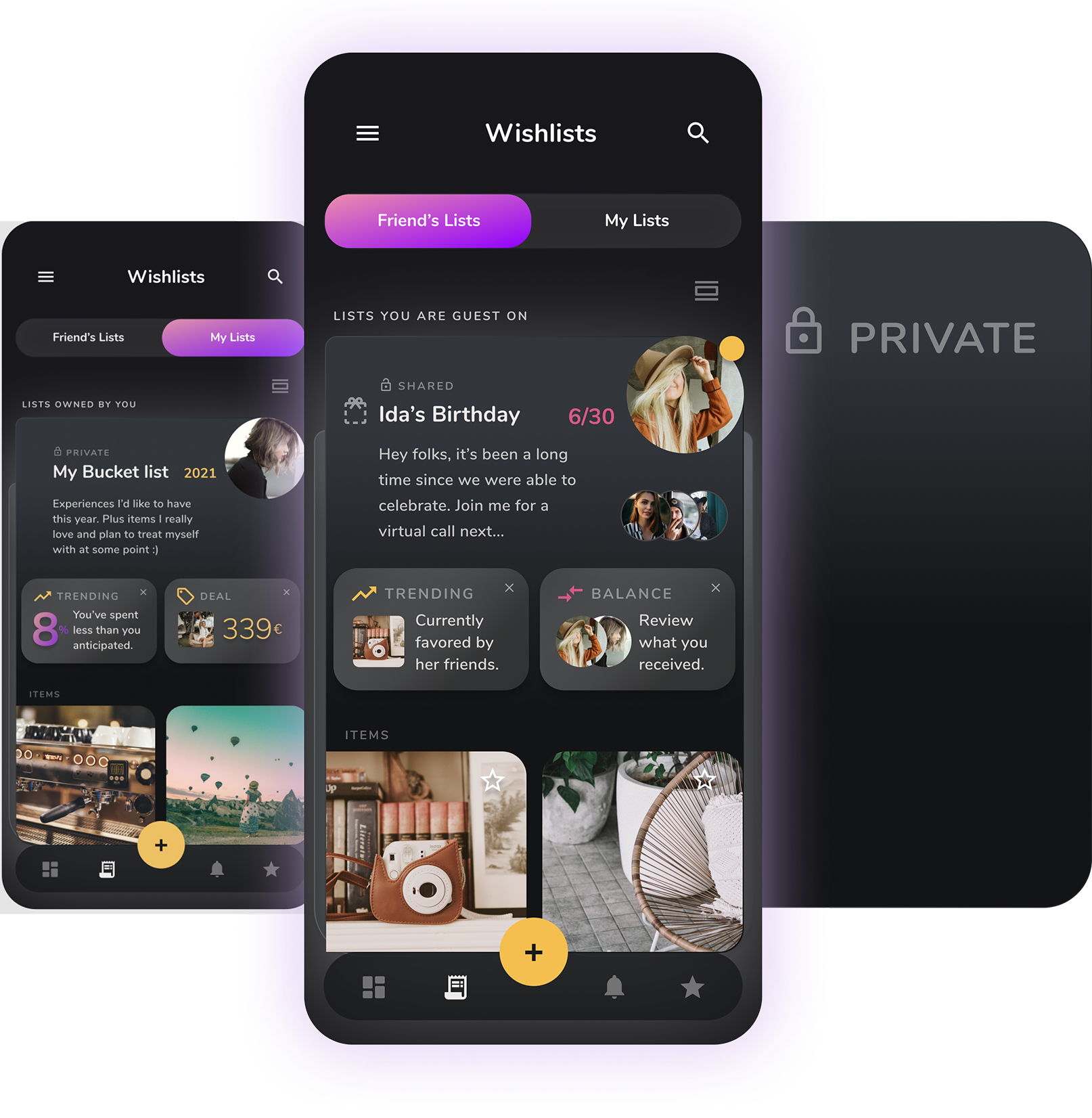
Focus on privacy - your wishlists can be shared or kept private
All other lists a user can see are, by default, shared lists. The precondition for user A to have access to a list of user B is that B invited A to this specific list. The list owner can define a person or a group to grant access to a list.
FAB FOR Primary actions
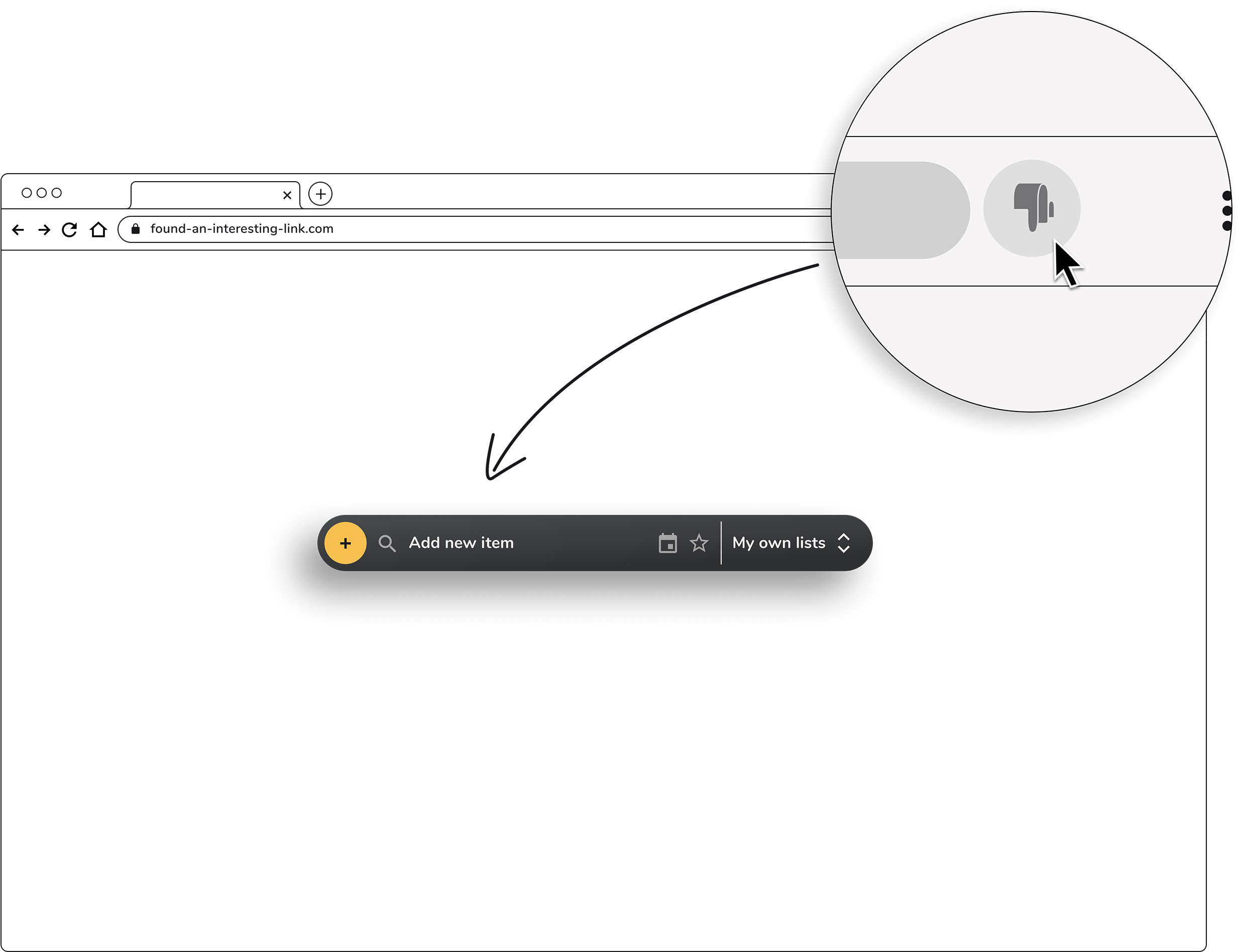
Upload ideas
The goal was to ease the process of capturing ideas. For core steps I needed to ensure potential taps and swipes would be minimized. I decided to implement an FAB (Floating Action Button) for primary actions.
As a typical Call to Action (CTA) element, I kept it in the primary yellow color of the shhlist color scheme to draw visual attention. Once activated, the button changes color while moving to the right edge of the screen.

Floating action button revealing the main actions
When it comes to form, function and positioning I largely followed material.io’s recommendations. I chose the “regular” shape, a circle with a tap size of 56dp and placed it centered on the bottom navigation bar.
“The trick is to design for the flow of the thumb zone.”
Samantha Ingram on smashingmagazine.com 8
Research clearly shows a huge benefit in placing core actions in this area of a mobile touchscreen. In his book “Designing for Touch” the author Josh Clark states that “75% of interactions are thumb-driven”. Thumb-zone mapping helps to define a good positioning for primary actions.
With this transition the FAB displays a box menu containing related actions. In the example shown above, the user can create a money pool, create a list, upload an idea, or invite a contact. According to material.io an "FAB should be relevant to the screen on which it appears", so the primary actions might vary to match the context.
Offline mode
Items, ideas or lists that a user uploads without proper internet connection will be uploaded as soon as they are online again.
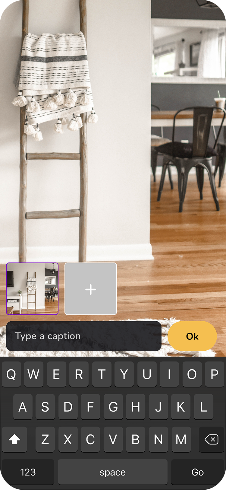
Upload ideas whenever, wherever
All in one
Social network features
All friends invited to a list (guests of a list) can connect via the app. They are able to invite each other to money pools, lists or a chat group.
SHARE IDEAS
Guests of a list can suggest a secret gift idea, which remains hidden to the list owner.
Almost always, there’s at least someone who is better informed about the giftee’s wishes, a favorite color, an actual size, a trend that’s being currently followed or a lifestyle change, etc. Or someone just happens to have more ideas than they are planning to give as present. The surplus of ideas can be shared with the group.
SUGGEST AN IDEA TO A GROUP, AND KEEP IT SECRET FROM GIFTEE
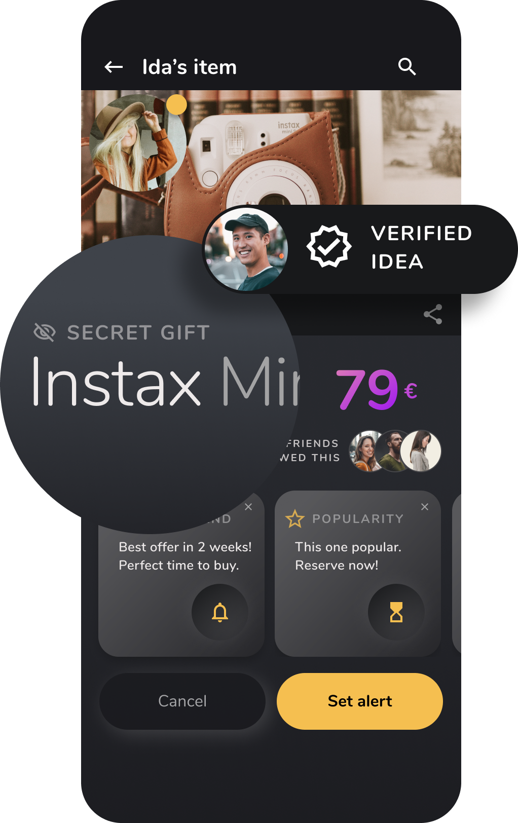
Guests can verify secret gift ideas of other guests
VERIFY CONTENT
Once a guest makes a suggestion which is kept secret from the giftee, other guests can contribute and endorse. Like that, the idea gains credibility. It’s no longer just one guest’s opinion, but multiple people can buy into it.
This transforms the whole gifting task to something that rather feels like a fun and rewarding experience. The gist of it was to create an intimate network to source unique ideas from within and for a specific circle of friends.
Notifications
Synchronizing a group can get quite messy at times - the larger the group the more potential for misunderstandung, delay and frustration. Surely, you can use several apps for each subtask’s purpose. However, the more channels of communication there are, the less smooth the information flow becomes. If a user has to switch apps, the cognitive load increases significantly. All apps and channels with different states and amounts of information need to be synchronized manually.
Being able to gather everything revolving around the gifting process in just one app, makes life much easier for the user. It also reduces the likelihood for miscommunication and outdated information.
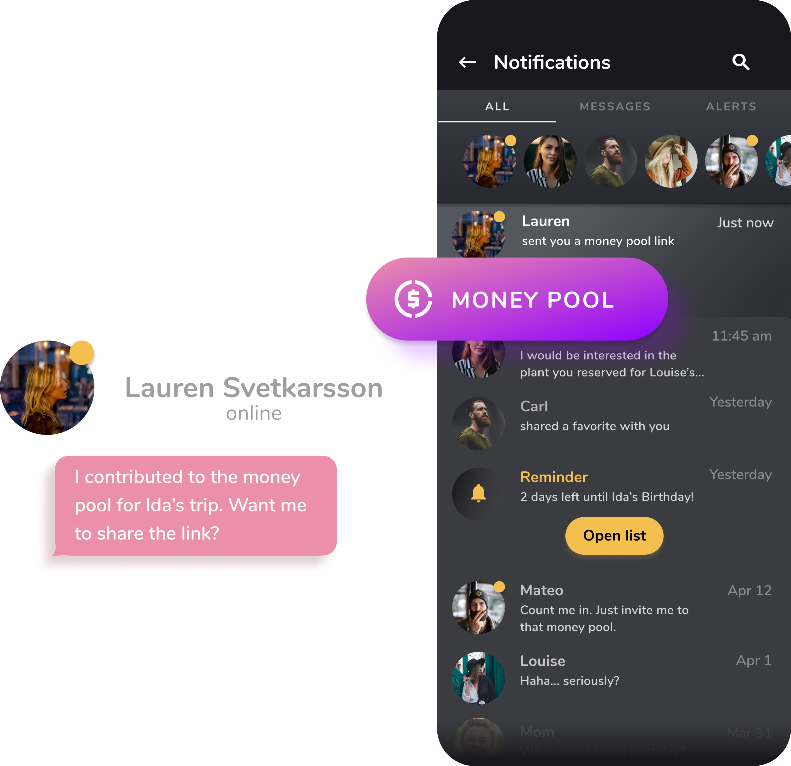
Money pool link shared via notifications
GROUP WITH OTHERS FOR A BIGGER PRESENT, ESPECIALLY IF YOUR BUDGET IS LOW
Money Pool
A money pool can be a good choice in many ways. It enables a user to easily group with others for an even bigger gift, especially when one’s personal budget is low. The collected money can be used to buy a physical gift or the amount can be handed over or transferred to the giftee’s bank account.
Only setting a deadline for contributions is mandatory. Conditions for contributions can be completely defined according to the group’s needs and wishes. If a group wants to reach a certain sum for a specific item, a fixed amount for each contribution can be set. For a gift that’s rather flexible from monetary point of view, like money for a trip, allows the contributions to either an individual choice or a certain range.
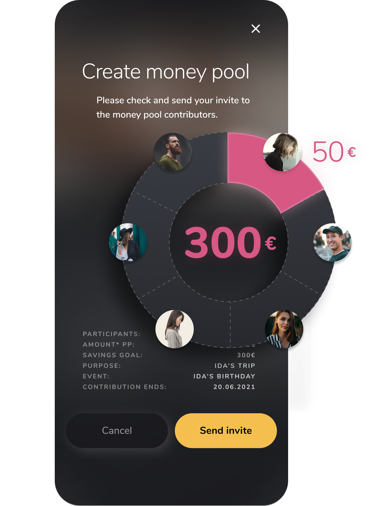
Manage group actions condensed in one app - ideas, communication and money pooling
A money pool allows the user to not only save cash but also time. The organizational part needs to be taken over by at least one user, the owner. This person creates the pool, invites members and manages contributions and all relevant communication. Optionally the owner can give permissions to others to share responisbilities. Other than that the money pool members just need to make their contribution in time.
Make the app scan the market for you
Delegation and timing
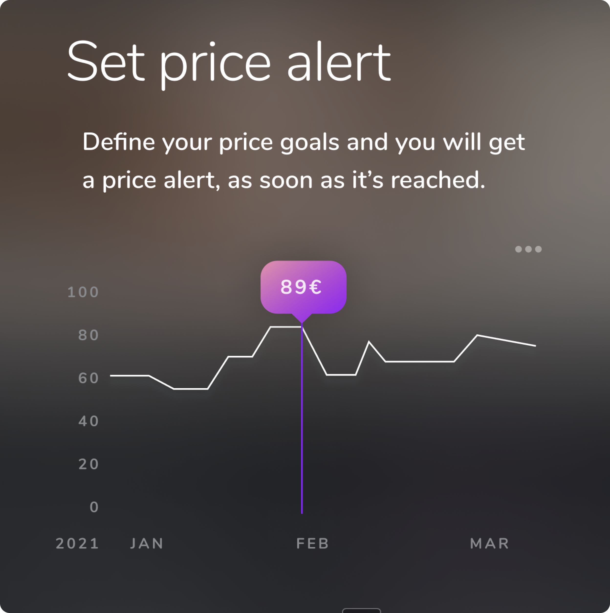
Price alert
Whenever the user is interested in a potential gift but at that time doesn’t consider the price a good deal, they can set an individual goal and monitor the price development. A notification informs the user, as soon as the price expectation is being met.
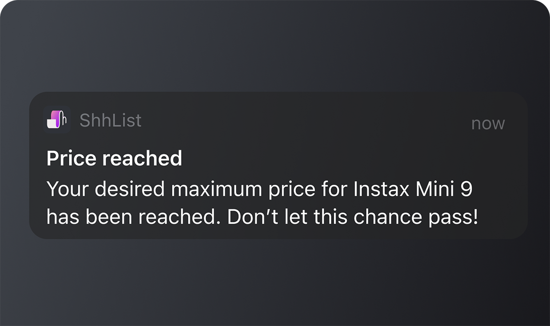
Price alert
Keeping in mind the user’s main ambition to get a good gift for a reasonable price on time, it’s vital for the app to provide an evaluation of the probability of this scenario to actually happen.
Based on the data provided by the user (price goal, deadline) and existing data of the article (price development in the past, estimated future peaks or lows), the app will compute whether setting the alert is realistic.
Monitor the price development within your defined time window
Price alert
A gift, being mostly handed on the occasion of something, like e.g. a birthday, mostly comes with an inherent deadline. On top of that, the user’s quest for a present might happen rather last minute. Given the aspect of limited time to get this task done, a price alert should be evaluated by the app to avoid trouble. A price alert can seem like a promise to the user, who might tend to lean back and rely on things getting done in the background.

Photo by Franki Chamaki on Unsplash
All the more important is, that while setting the alert, the user will be notified about the app’s assessment and recommendation. With this, they have transparency of the situation and can adjust gifting options as needed. This avoids unnecessary desillusion and helps to enhance the user experience.
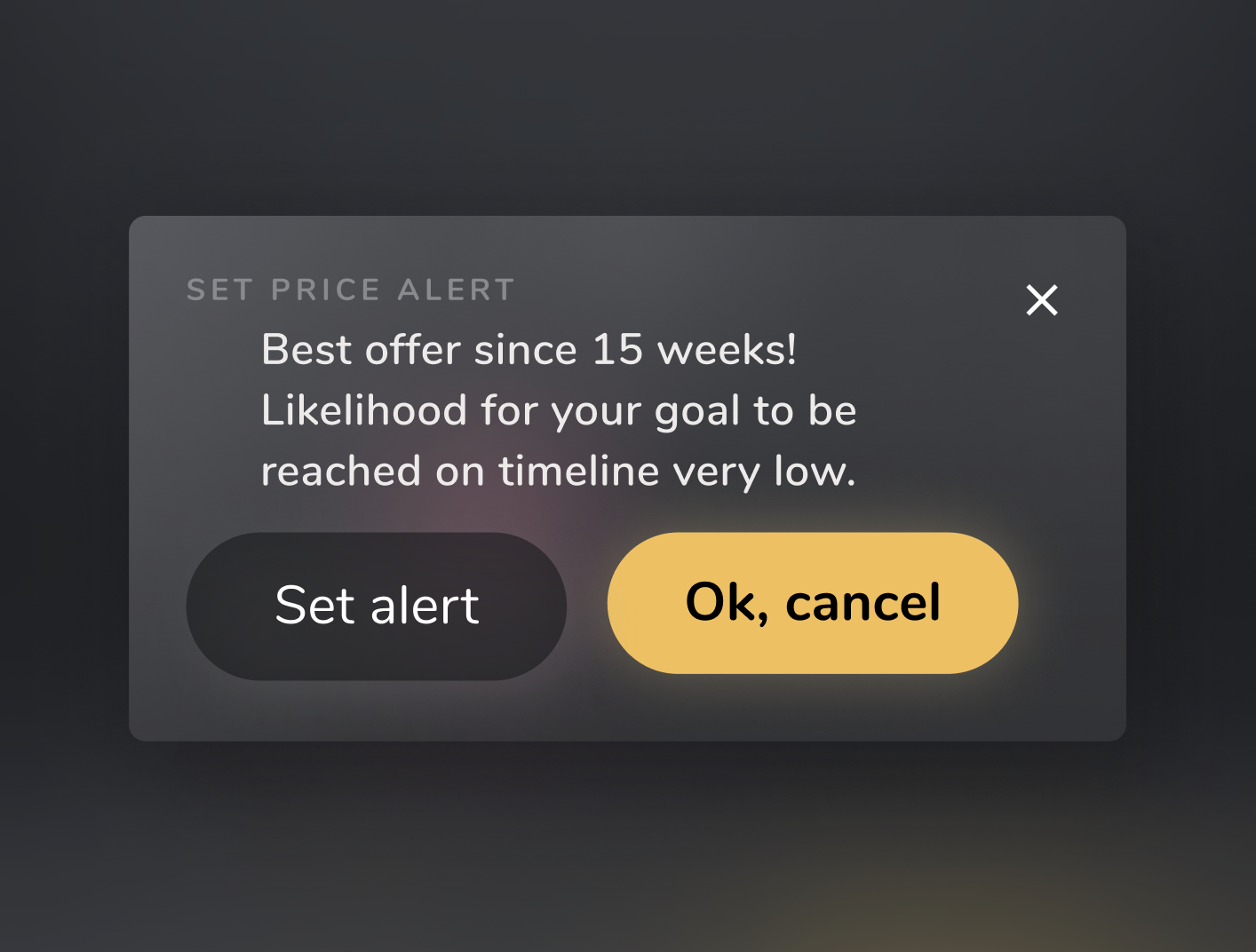
Giving a heads up based on probability
RSVP
If the user has a preferred item, but is still not 100% sure whether or not they want to purchase it — or perhaps they simply need to double-check with a contributing gifting partner — they can simply reserve the gifted item to be held.
RSVP IF YOU LIKE A GIFT BUT PREFER TO SLEEP ON YOUR DECISION

Sleep over one's decision a night
Other guests on the list will be notified to see the reserved status and vice versa. This feature is implemented to avoid several friends potentially picking the same gift.
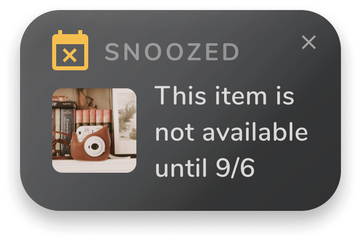
Reserved item marked as currently not available
Everything on your screen
Manage your data
Dashboard
Upon opening the app, the default view or home view is the dashboard. Here, the user has the full overview on their defined budgets, upcoming events (access to calendar) and customizable information in the form of a newsfeed.
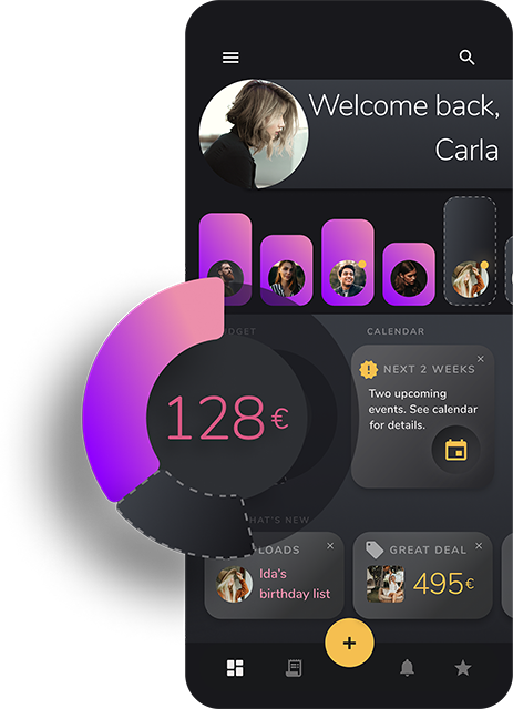
Dashboard congregating core info and tasks
Favorites
Favorites contain all items or lists a user marked with the star icon. A toggle button allows the user to divide the sections of their own favorites of those they marked as potential gifts for friends.
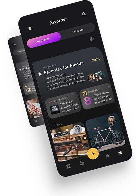
Toggle between the favorites you marked for friends and your own
In the ‘My own Favorites’ area, the user will be able to see trends, like frequently clicked articles as well as their budget, event reminders or their own set deadlines for a purchase.
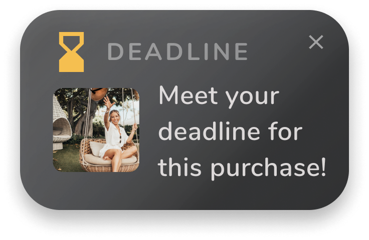
Procrastinator? Set yourself a deadline
As a user, one can also directly access money pools and reserved articles in Favorites, as those are items one’s already committed to. These commitments are of higher interest than regular items of a list and can therefore be found here.
Browsed items can be marked with a star by the user at ease. They will be stored in the Favorite section, being accessible at any time in one click of the bottom navigation bar.
Get it done
Purchase
Payment
When purchasing an item, the user first chooses a payment option, like credit card or something similar (i.e. PayPal, Klarna, etc.). In the second step, they need to confirm the purchase on the touch sensor or by PIN.
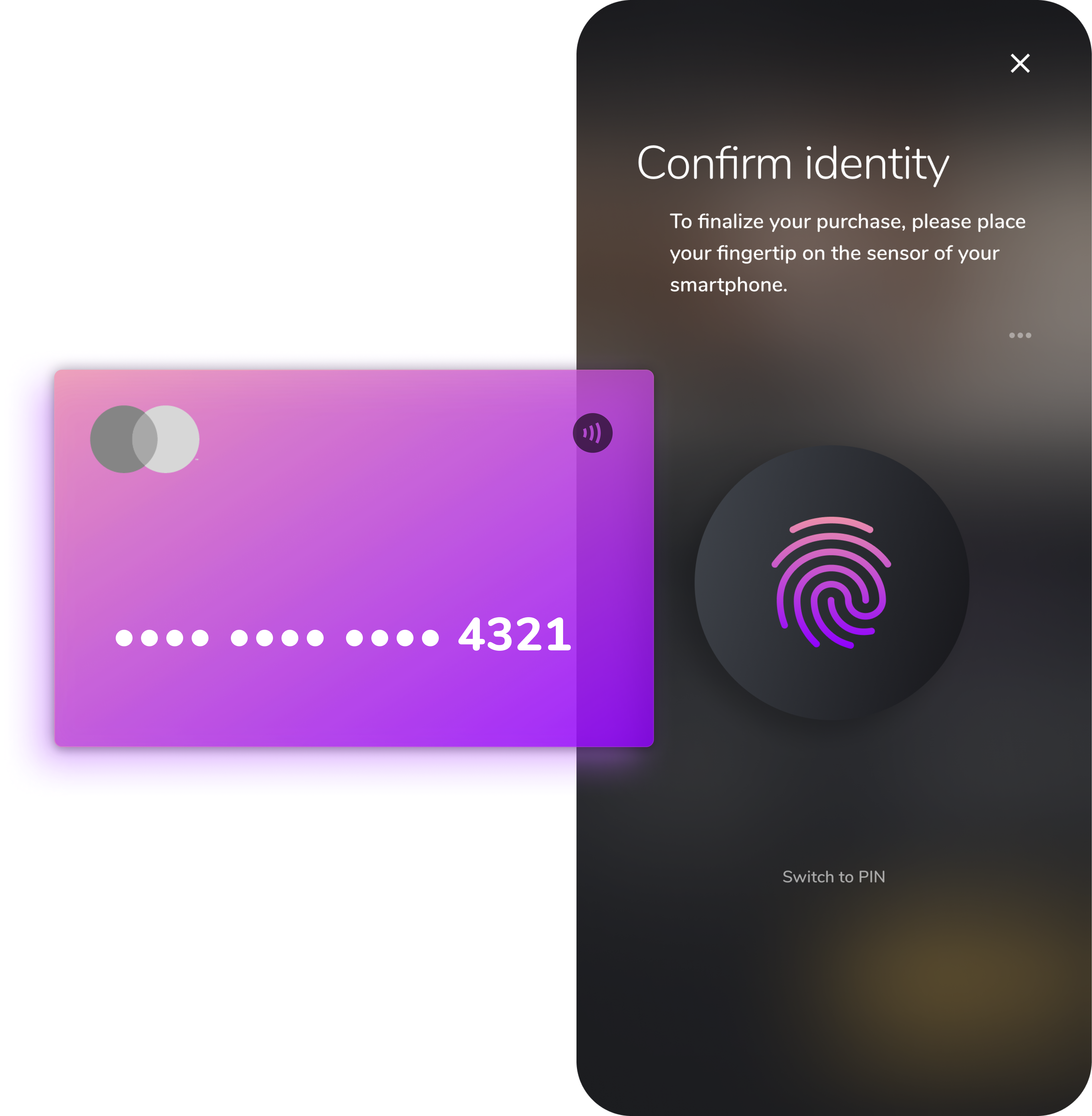
Payment - Verify via Touch ID
Technically, the purchase is supposed to happen via affiliate marketing.
When a user purchases a product, it will be marked for others as ‘gone’ on the according wishlist.
Sync & Integrate
Functionality across devices and platforms
Browser extension
The mobile app is the core of my shhlist concept development. To fully guarantee a smooth and frictionless user experience, I considered a certain degree of cross device functionality as an essential part of its creation.
The browser extension or addon (like Google Chrome extension) allows the user to upload a link from a desktop website effortlessly, without requiring the user to leave the browser or open the app.
ShhList as Google browser extension
Business use
One of the cases for a user potentially feeling a strong obligation for gifting while at the same time having no clue about what’s apprpriate, is in business context.
Finding a suitable present for a colleague or supervisor can be challenging. If a user opts for a group present, collecting money for a collaborative gift is a nice workaround for the group but time consuming for the colleague who organizes. All in all, office gifts can end up being an inconvenient necessity, consuming time and nerves during working hours or your freetime.
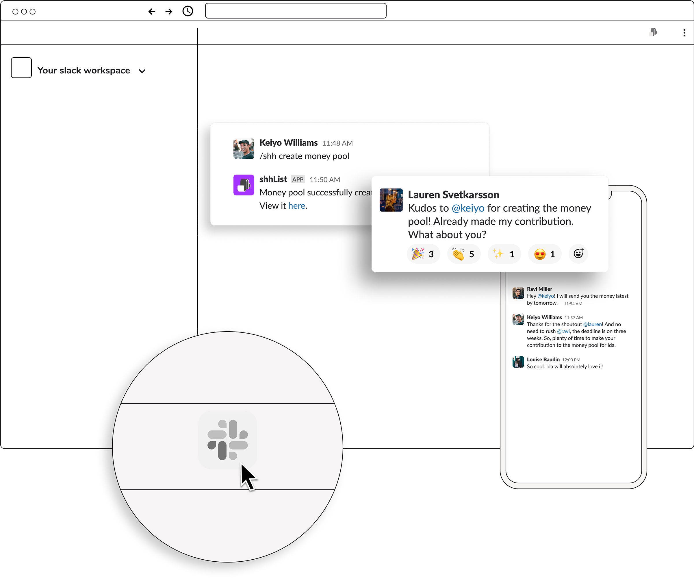
Usage in business context - Slack integration
With the shhlist slack integration, this task can be easily organized and managed almost incidentally. The main advantage is, that the organizer themselves are not forced to leave their work environment for the gift handling. They can basically solve this task on the go: collect ideas, align with a group, check contributions etc. - everything in the app they use for work communication anyway. This saves clicks, time, and energy while keeping the cognitive load on a required minimum.
Wrapping it up
Summary
The overall goal of the shhlist app is not just achieving a higher gift quality. What shhlist offers is much much more. The app provides guidance and support with a task, that has the potential to leave a big impact on relationships.
The app is beneficial for both giver’s and receiver’s side. The giver can outsource a huge part of the task, by storing and organizing ideas, making use of the swarm intelligence of their networks, using data as decision base for tricky decisions, channeling communication and group planning, and feeling rewarded for support and contributions. Where cognitive load reduces and stress can be avoided, there’s room for the fun part of gifting to be rediscovered.
From the giftee’s point of view, it’s not only easier to communicate wishes in one place. Also receiving a spot-on gift, sometimes even one that’s unexpected, can hardly be surpassed.
With shhlist a former source of misunderstanding, hassle and irritation turns around to be a positive emotional boost for both sides.
-
https://www.sciencedaily.com/releases/2014/12/141222111553.htm ↩︎
-
https://www.researchgate.net/publication/229401471_Give_them_what_they_want_The_benefits_of_explicitness_in_gift_exchange ↩︎
-
https://www.thinkwithgoogle.com/consumer-insights/consumer-trends/pandemic-gift-giving-behavior/ ↩︎
-
https://www.bbc.com/worklife/article/20191206-the-science-behind-giving-good-gifts ↩︎
-
https://www.gartner.com/en/newsroom/press-releases/2014-01-13-gartner-says-less-than-one-tenth-percent-of-consumer-mobile-apps-will-be-considered-a-financial-success-by-their-developers-through-2018 ↩︎
-
https://www.emarketer.com/content/most-apps-get-deleted-within-a-week ↩︎
-
https://www.smashingmagazine.com/2016/09/the-thumb-zone-designing-for-mobile-users/ ↩︎